

CoPilot Portrait-Mode Workout Player — An Enhanced Workout Experience
This project aimed at improving the product core experience by introducing a portrait orientation option to the preexisting workout player. It was one of the biggest core feature updates since the app launched in 2019.
My Role:
As the Lead Designer in this project, I facilitated the design process through extensive desk research, 5 rounds of design iterations for the iOS & Android app, 2 rounds of usability tests with the design prototype while gathering feedback from the stakeholder/product manager to inform our design decisions. As a ground-up build, I established new interaction patterns and components for CoPilot’s design system.
Timeline:
Oct - Dec, 2022
(2.5 months)
Tools:
Figma (Design)
Maze (Usability Test)
iOS & Andriod App
Platform:
Research
UX/UI Design
Usability Testing
My Area of Focus:
Matt Spettal - CEO & Product Manager
George Gonzalez - iOS Developer
Ana Krulec - Android Developer
Team:
The Problem
While users can use the preexisting workout player for in-app workouts, the landscape orientation is not optimal for the context of use, or any additional tasks that users may want to do during a workout, whether inside or outside of the app.
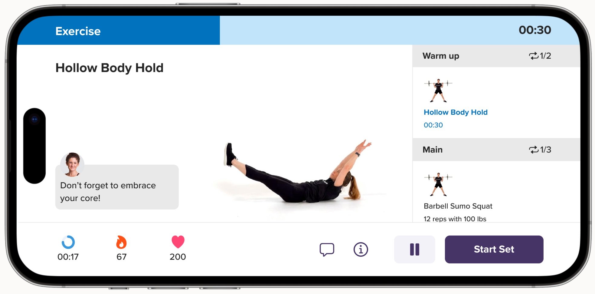
Preexisting Workout Player in Landscape Orientation
Users’ Wants…
As a user who keeps my phone in my pocket during workouts, I prefer to navigate the app with one hand as I usually take it out of my pocket with one hand. It is not easy to do in the current landscape workout player.
For the Context of use
As a user, I want to switch to other apps during a workout seamlessly. Most of the other apps, such as music, notes, and messager apps, are vertically orientated.
Tasks outside of the app
As a user, I want to send notes to my coach without constantly rotating my phone during a workout.
Tasks inside of the app
How Might We
Convert the existing landscape workout player into a portrait view design without compromising the existing functionalities while creating a seamless workout experience?
The Outcomes
Through researching design patterns from relevant products on the market, gathering constant feedback from stakeholders and engineers to ensure technical feasibility, and conducting usability tests with users to validate the intuitiveness of the design, I went through 5 rounds of design iterations before shipping the Portrait-Mode Workout Player - Version 0. This version represented an MVP design solution that struck a balance between meeting users' needs while considering the limited time and development resources.
In this project, we not only built a portrait-mode player that is consistent with the functionality and design of the preexisting landscape player, but we also improved some flaws and imperfections. The implemented portrait-mode workout player is currently in use by 5,000+ users daily to stay active!
Highlights and Feature Updates
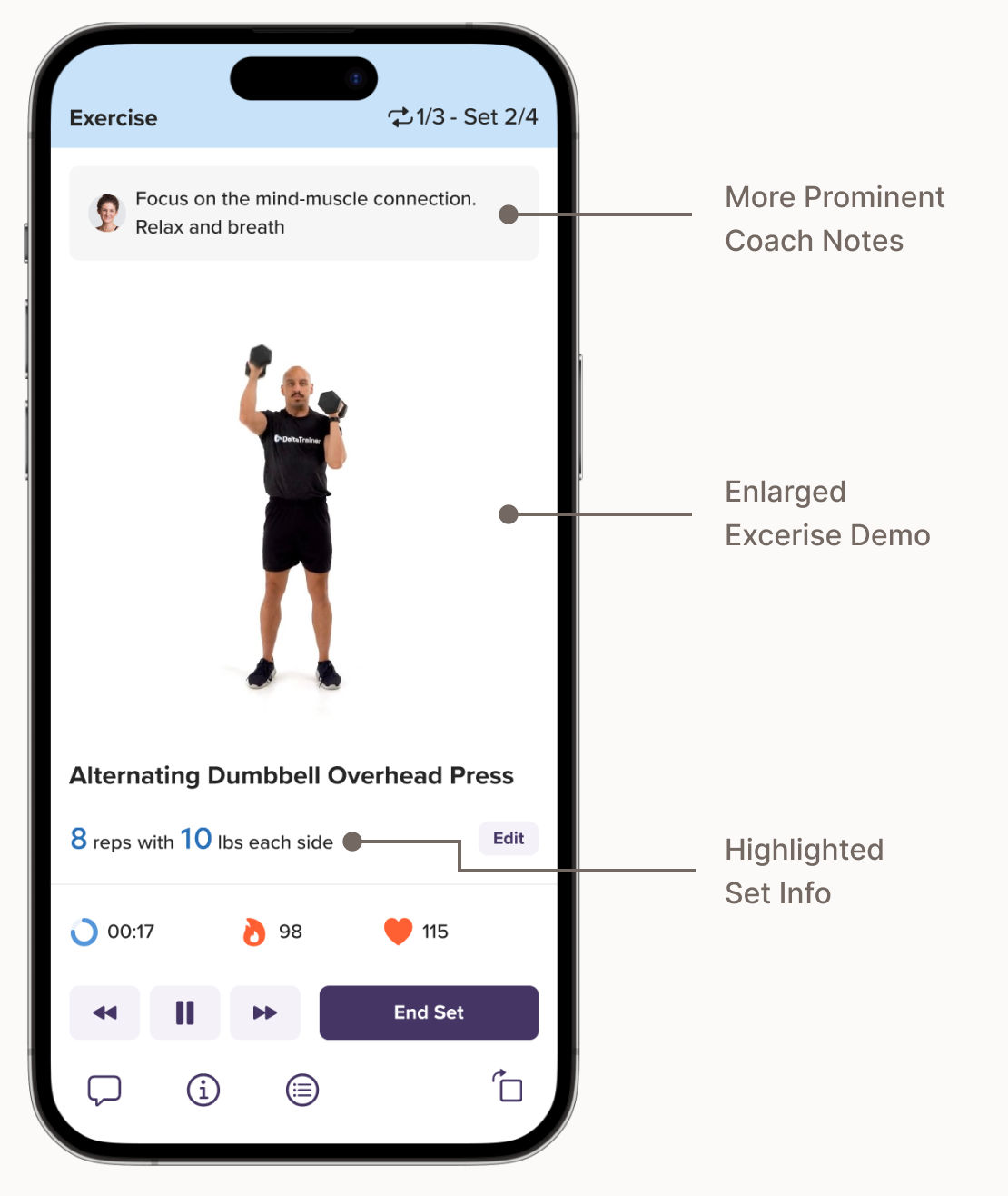
Enlarged Exercise Demo for Improved Focus
The Goal
We aimed to make the exercise demo, coach notes, and set info more visible. Considering these are the primary content and users typically view their phones from a distance during workouts.
The Solutions
To avoid overwhelming users with excess information on the main workout screen. I adopted a modality design pattern to present secondary content and action, including the exercise list, instructions, and chat, in a separate view. This allowed for more screen space on the main screen and increased user focus.
The Outcomes
Enlarged exercise demo (30% larger than the preexisting landscape player)
More prominent display of coach notes (increased font sizes by 13%.
Easy Navigation to Exercise List and Instructions
The Goal:
Enable users to preview upcoming exercises and access exercise instructions during workouts without disrupting the main flow of the workouts.
The Solutions
A new navigation component was created to allow users to open and exit the exercise list and instructions with a simple tap of the designated icon buttons. The navigation component also hosts other supplementary actions, such as chat and screen rotation.
The Outcome
An intuitive interface where users can efforfordnessly switch between different views as needed

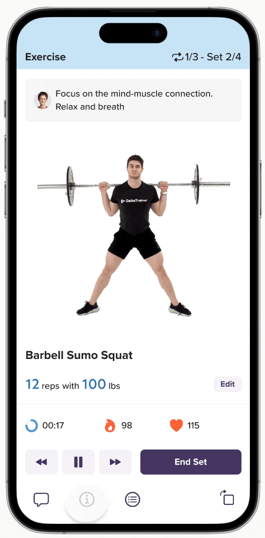
More Accessible Reps and Weights Editing For Exercise Sets
The Goal:
We aimed to increase usage for the reps and weight editing feature to help coaches make personalized adjustments to users’ workout programs.
The Solutions
Made the functionality more discoverable by indicating it with an “Edit” button. The action is presented as a focused experience using a model presentation; Also, I replaced the picker input control with numeric text fields and increment & decrement buttons for more efficient input.
The Outcome
During usability tests where we asked users to edit the reps and weight after completing a set, over 88% of users were able to complete the task within 10 seconds, from which over 70% said it was extremely easy to use.
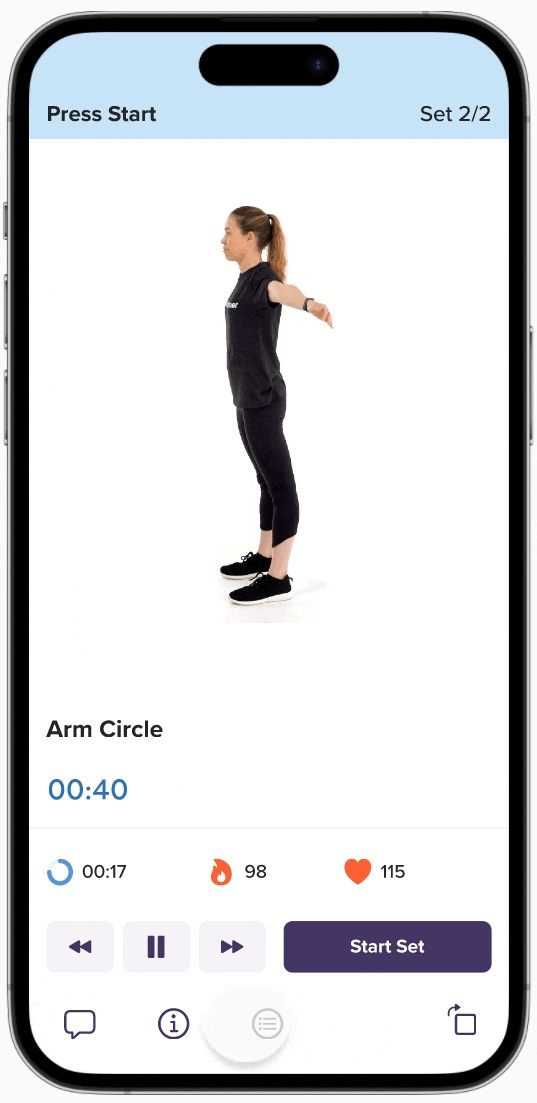
Enhanced media control buttons for maximized control
The Goal:
Enable users to start/end workouts and navigate through sets and exercises on the exercise list at all times during workouts.
The Solutions
I made improvements to the media control button design by adding a backward and forward button. The button set is a sticky element that remains at the bottom of the screen for easy access at all times.
The Outcome
During usabiltiy test where we asked users to skip to the next exercise, 72% of users were able to complete the task, from which over 70% of the users said it was easy to use.
Project Background
During 2022, the CoPilot product team released a number of significant updates to the platform, including the introduction of healthy habits, gamification features, and a revamped referral user flow. Despite receiving positive feedback from users, we did not see any significant improvements in acquisition and retention metrics.
Aiming to find a breakthrough, we conducted a series of product strategy planning sessions with the stakeholders and interviewed our existing users. we discovered that past campaigns had placed too much emphasis on fulfilling business objectives while neglecting the fundamental needs of our users. To address this, we have created a product roadmap that prioritizes improving the core experiences of our users. The in-app workout experience is one of the focus areas.
With that in mind, I revisited our previous user research findings to brainstorm a list of features the product team can work on to improve the workout experiences. We eventually decided to kick off the In-app workout experience enhancement project with the workout player Portrait mode features, based on the fact that it has been in high demand by users since the app’s launch in 2019.
Defining Project Scope
During the kick-off meeting with stakeholders, we agreed to keep all essential features and interface design of the preexisting workout player. Given that we have done a UI refresh to the landscape workout player at the beginning of the year. We didn’t want to introduce new designs too soon and confuse our users. We wanted the updates to be as seamless and intuitive as possible!
Key Features & Requirements:
Exercise demo should be easily visible and prominent
Users can read notes from their coach while working out
Users can access muscle charts and exercise tips when needed
Users can skip to specific sets of exercises
Users can edit the reps and weights for each exercise
Users can easily switch between landscape and portrait orientation
The Research
Before designing, I started by observing the interface and interaction of other fitness apps on the market. Flagship fitness apps like Peloton, Nike Training Club, and Apple Fitness all have a video-based workout player that can be rotated between landscape and portrait orientation, the interaction is mostly like the Youtube video player. In CoPilot, all of the workout demos are in gif format, so the video player modal won’t work.
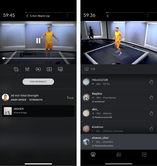
Peloton
Nike Training Club
FitnessAI

Apple Fitness
I then looked into other boutique fitness apps like FitnessAI and Fitbod. While none of these apps has a landscape orientation, a common pattern I found is that they all have an enlarged workout image/video that occupies at least 50-60% of the top portion of the screen for easy viewing. Since the ability to edit reps & weights is a key requirement, I specifically looked into how these apps handle the interaction. I was drawn by the interaction on FitnessAI, where they diminished the size of the demo when the edit model was pushed up.

To help me think outside the box, I eventually expanded my research to non-fitness apps. Music apps came top of my mind as they shared similar features like playlists and control buttons. I looked into Spotify, YouTube Music, and Apple Music. Of all, I found the bottom bar navigation on Apple Music to be particularly intriguing. It utilized full-screen models to display content, which I found to be an elegant way of managing content without cluttering the main screen.

Apple Music App - Bottom Bar Interaction
Design Explorations
Exploration 1 - FitnessAI inspired
I explored using a model bottom sheet to reside most content (except the exercise demo). The model moves up whenever users want to access the content. The exercise demo would diminish so it remains visible to users at all times.

Internal Feedback within the Product Team:
It seems a lot going on in the workout screen when transitioning between model sheets. This may potentially be too distracting and take away from the user's workout experience.
Overloading the model sheets might cause the app to lag
It is nice to have the exercise demo visible at all times, but it is technically challenging to diminish the size of the gif. It may be best to consider excluding this feature from our MVP version.
The rep and weight information is hard to read
Coach note is not as discoverable
My Thoughts:
I agreed with all of the feedback except that I was hesitant about forgoing the exercise demo when displaying other content. Based on my early exploratory interviews with users, I learned that users prefer to see the exercise demo throughout the workout.
With the initial feedback in mind, I further explored other possible options to address the technical difficulties while focusing on fulfill the user’s needs and project requirements.
Exploration 2 - Apple Music App inspired
To mimic the Apple Music App interaction, I explored adding a bottom navigation bar to divide content into various tabs. Instead of having to diminish the exercise demo, the image is now embedded on the tab wrapped inside the existing navigation row component.

Internal Feedback within the Product Team:
Overall, the team thought this was a much cleaner design that felt less overwhelming. A few concerns were:
Not sure if our users would be familiar with the interaction of tapping the same icon on the navigation bar to open and close the tabs. This is a different interaction than the main navigation bar on the app.
The Coach notes are more noticeable, but they cover part of the demo, which is not ideal. Also, it appears to be a completely different pattern than the landscape player, which would cause inconsistency when users switch between landscape and portrait.
My Thoughts:
I seconded that this design is simpler and less visually distracting for users. I set out to explore a more elegant solution for the coach notes and have taken notes to pay more attention to the UI consistency between the landscape and portrait mode for future iterations.
Usability Testing
Having narrowed in on a design direction, I teased out Exporation 2 and created a clickable prototype to validate the design with real users, utilizing the usability testing tool on Maze. I completed 2 rounds of usability tests with a total of 216 users. I created various task scenarios with the objective to find out if users could easily understand and execute the following interactions:
Skipping to specific exercises
Edit rep counts and weights
View Coach notes
Key UX Problem:
During usability tests, I discovered that it took users more taps than wished to skip to specific exercises and return to the main workout screen. Also, the interface was not clear enough to indicate to users that they needed to access the exercise list in order to skip certain exercises.

In the Landscape player view, accessing the exercise list is easy as it is readily available on the main workout screen, so it did not appear to be a challenge for most users.

Solutions: Added a backward and forward button to the player controls to enable users to skip between exercises easily.